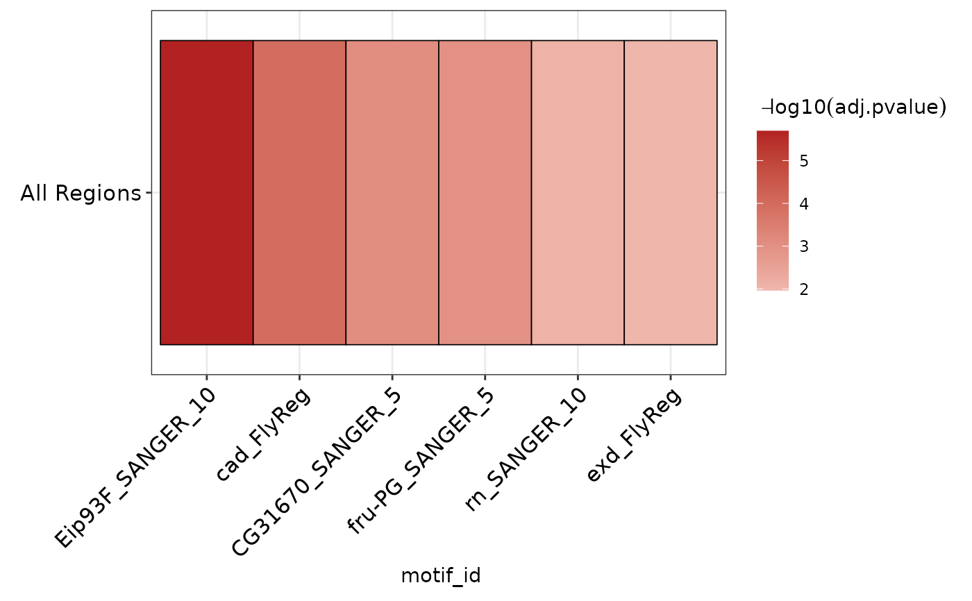
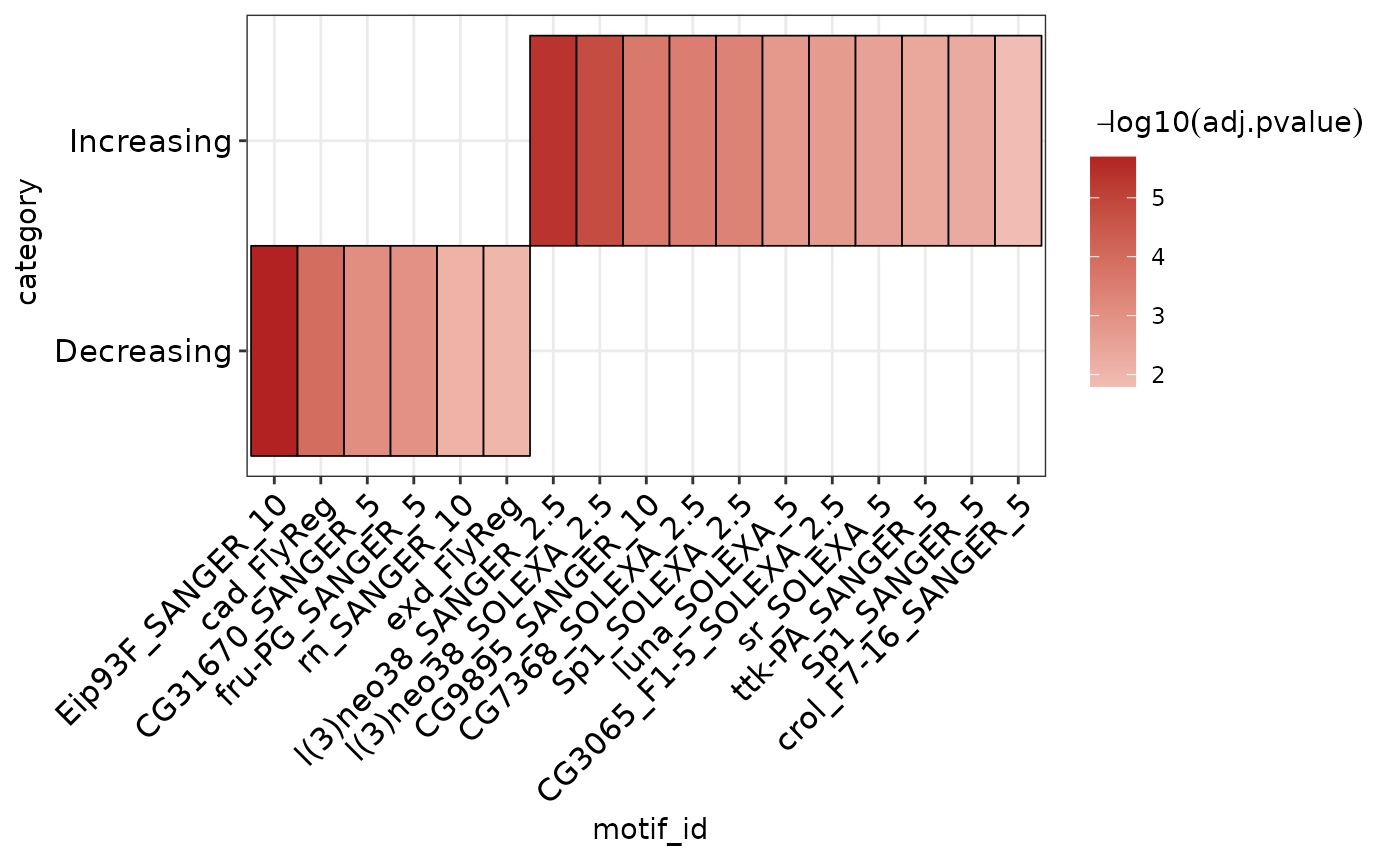
Plot AME heatmap clustered by similarity in detected motifs
Source:R/ame_methods.R
plot_ame_heatmap.RdPlot AME heatmap clustered by similarity in detected motifs
plot_ame_heatmap(
  ame,
  id = motif_id,
  group = NULL,
  value = -log10(adj.pvalue),
  group_name = NULL,
  scale_max = NA
)
Arguments
- ame
ame results data.frame
- id
column of motif ids to use (default: motif_id).
- group
grouping column if comparing across multiple ame runs (optional, default: NULL).
- value
value to display as heatmap intensity. Default: -log10(adj.pvalue). Takes function or column name as input. If set to "normalize", will use normalized rank within `group` as the heatmap values. **If in doubt**, prefer the -log10(adj.pvalue) plot potentially in conjunction with adjusting `scale_max`. (See "Normalized rank visualization" section below for more details on how to interpret these data)
- group_name
when group = NULL, name to use for input regions. Ignored if group is set.
- scale_max
max heatmap value to limit upper-value of scale. Useful if distribution of `value`s vary greatly between groups. Usually a better to tweak this option than to use value = "normalize". The cumulative distribution plot generated by `ame_compare_heatmap_methods()` can be useful for selecting this value, try to pick a value which captures the largest fraction of hits across all groups while excluding outliers.
Value
`ggplot` object
Details
Normalized rank visualization **NOTE:** The normalized rank visualization eliminates all real values related to statistical significance! Instead, this visualization represents the relative ranks of hits within an AME run, which already pass a significance threshold set during `runAME()`. This means that even if several motifs have similar or even identical pvalues, their heatmap representation will be a different color value based on their ranked order in the results list. This also means that using the normalized rank visualization will be misleading if there are only a few AME hits; it is only worth using if the number of hits is very large (>100). Both visualizations can be useful and reveal different properties of the data to the user during data exploration. Use `ame_compare_heatmap_methods()` to help assess differences in the two visualizations. **If in doubt**, prefer the `-log10(adj.pvalue)` representation.
Common mistake: if `value` is set to a string that is not "normalize", it will return: "Error: Discrete value supplied to continuous scale". To use a column by name, do not quote the column name.