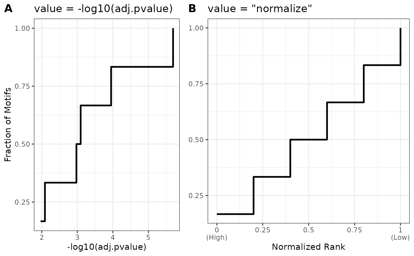
This helper function allows the user to visualize the distribution of their AME results data on different scales to help understand the implications of using different values in `plot_ame_heatmap()`
ame_compare_heatmap_methods(ame, group, value = -log10(adj.pvalue))Arguments
- ame
ame results data.frame
- group
optional name of group to split results by
- value
value to compare to "normalize" method (default: -log10(adj.pvalue))
Value
a cowplot 2 panel plot comparing the distribution of `value` to normalized rank values
Examples
data("example_ame", package = "memes")
ame_compare_heatmap_methods(example_ame$Decreasing)